Japanese Color Palette That Never Goes Out of Style
I’d like to invite you to play an imaginary game.
Picture your closet right in front of you! There you are, about to head out to work, but you have no idea what to wear. Everything looked so good in your head, but in reality, somehow nothing goes together.
I used to think my clothes were to blame. In reality, however, the Japanese color palette is the missing link I didn’t even know was missing – that same understated mix of ink, stone, and cream tones that makes Japanese minimalist fashion look expensive without even trying.
Here’s what I mean. Japanese style rarely reaches for bright colors just for the sake of color. Instead, it uses a handful of subdued, natural shades that have been refined over centuries, and once you get to know them, getting dressed no longer feels like a guessing game.
In this post, I’ll guide you through the world of colors that form the foundation of this style. I’ll show you what to pair them with and highlight a few authentic pieces you can buy today.
Stay tuned, because the sixth color is one that few people talk about – yet it might just be the most useful of them all.
Disclosure: This post contains affiliate links. If you make a purchase through these links, I may earn a small commission at no extra cost to you. Thank you for supporting my blog!
How the Japanese Color Palette Actually Works
Traditional Japanese color theory groups shades into a few families. There are deep neutrals like ink and indigo, warm neutrals like tea brown and ochre, and a couple of soft, almost whispered accents like cherry blossom pink or bamboo green.
The whole system is built on restraint rather than variety.
The rule of thumb is simple.
Pick one deep neutral as your base, one warm neutral as your bridge, and let a single soft accent do all the talking.
That’s the entire logic behind a Japanese minimalist fashion color palette, and it works whether you’re building a capsule wardrobe or just trying to survive Monday morning with clean clothes that actually match.
What surprised me most when I actually studied this palette is how few true accent colors show up anywhere in it.
Most of the shades are neutrals with a temperature, warm or cool, and only a couple ever step forward as an actual accent. That’s the opposite of how most of us shop, where the accent color usually comes home first and the neutrals get figured out later, if at all.
There’s real research behind this too, not just aesthetics.
Japan has an entire academic field called Kansei engineering, dedicated to studying how color, texture and form shape our emotional response to design, including clothing. It has its own journals, including a special issue on Kansei engineering in textiles published through the International Journal of Clothing Science and Technology.
Researchers have also looked specifically at how color reads differently depending on fabric, in a comparative study on linen, cotton and silk published in Color Research and Application, which is exactly the kind of fabric and color pairing this whole palette depends on.
Before we get into the list, ask yourself a few things.
1.) Do most of your clothes already sit somewhere in the black, navy or cream family?
2.) Is there one bright color you reach for over and over, almost without meaning to?
3.) Would your closet feel calmer with fewer, better shades instead of more of them?
If you nodded at even one of those questions, this palette is going to make your mornings a lot easier.
What Milan Taught Me About Color, and Why Less Really Is More
A few years ago I was walking through Milan with my family, and I couldn’t stop turning my head. Every few steps there was another woman, another man, dressed so simply and yet so put together that I wanted to stop and ask what their secret was.
Nobody was wearing five colors at once. Most people wore two, maybe three, and one texture always did the heavy lifting, a linen blazer, a wool coat, a leather bag with some real age on it.
That trip is where I started paying closer attention to the Japanese approach to color, because it follows almost the exact same logic.
- Fewer colors,
- chosen on purpose,
- worn with confidence.
It’s not about owning less for the sake of it. It’s about every single piece actually working for you instead of competing for attention in your closet.
Quick Win: The One Rule to Steal Today
Before you read another word, try this.
Open your closet and pull every piece that is black, navy, cream or grey into one section. That’s your new base wardrobe, already there, already paid for. Everything else becomes an accent you add on purpose, not by accident.
Q u i z
Answer five quick questions and find out which Japanese color family actually matches your closet, then jump straight to that part of the guide.
9 Basic Colors of Traditional Japanese Fashion
Here is the actual Japanese color palette, the shades that keep showing up in minimalist Japanese fashion, in Japandi interiors, and honestly all over Pinterest right now.
I’m including the hex code next to each one mostly as a quick reference point, so you can match the exact shade if you’re shopping, painting, or just trying to picture it in your head.
If you want the fuller backstory on where these traditional Japanese colors for clothing actually come from, the Traditional Colors of Japan is a solid, well-sourced place to start, and the color library at Design Yokocho is a lovely visual companion if you want to see the shades side by side.
Black is modest and arrogant at the same time. Black is lazy and easy, but mysterious. But above all, black says this: I don’t bother you, don’t bother me.
Yohji YamamotoJapanese Fashion Designer
1. Sumi, the Ink Black That Isn’t Really Black
Sumi is the deep black used in traditional Japanese ink painting and calligraphy, and it’s almost never a flat, cold black. It carries a slightly warm, soft charcoal undertone, if you want the exact reference.
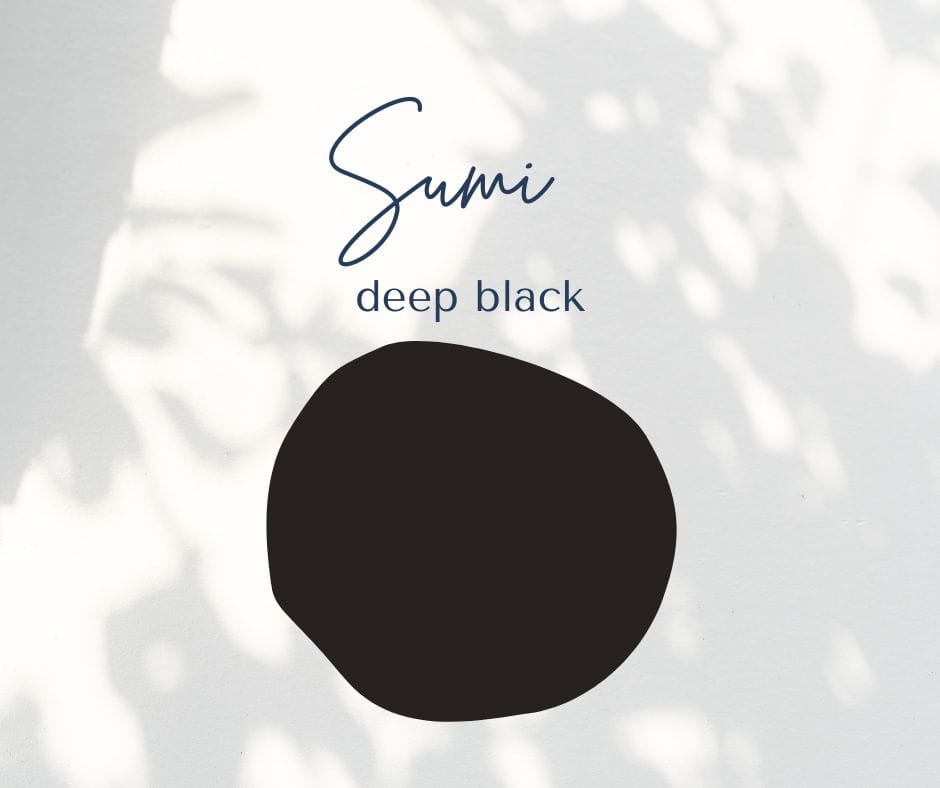
This is your deep neutral base, the anchor color the rest of your outfit builds around.
Try swapping your black tee for a soft charcoal one this week, and notice how much gentler your whole outfit reads next to your skin tone.
Pair sumi with shironeri cream rather than stark white for a softer, less severe contrast, and add one warm wood or leather accessory so the whole look doesn’t feel cold.
2. Kon, the Deep Indigo Every Capsule Wardrobe Needs
Kon is a deep, almost navy indigo, and it carries centuries of history.
Indigo dyeing, known as aizome, was used for farmwear, workwear and even firefighter coats in old Japan, and textile historians note that the dye itself has natural insect repelling and antibacterial properties, which is part of why it stuck around for so long.
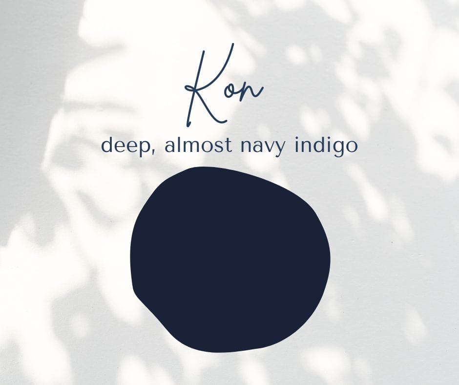
Kon works as a softer, more versatile alternative to black.
Reach for it on days when you want to look pulled together but not overly formal.
My favorite combination is kon with warm cream and a touch of ochre. Picture a deep indigo sweater, cream trousers, and a leather bag in a warm tan, that’s a full outfit built from three colors and it works for almost any errand, meeting, or coffee date on your calendar.
If you want the full breakdown of building a wardrobe around shades like this one, my complete guide to a minimalist capsule wardrobe walks through it step by step, and it opens in a new tab so you won’t lose your place here.
3. Ai-iro, the Lighter Indigo for Warmer Days
Ai-iro is a lighter, slightly greener take on indigo, traditionally used in the patterns on summer yukata. It comes from the same indigo plant family as kon, just processed to a paler shade.
Think of ai-iro as your warm weather answer to navy.
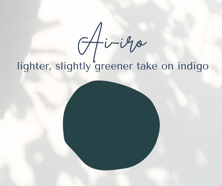
Swap it in for black on hot days when a full dark outfit feels heavy, and watch how much cooler it reads visually, even if the fabric is the same weight.
Combine ai-iro with shironeri cream for a breezy, coastal feel that still reads as intentional rather than beachy.
If your closet already leans toward this look, my post on minimalist summer casual outfits has more ideas to build from, also set to open in a new tab.
4. Shironeri, the Cream That Replaces White
Shironeri literally translates to something close to unbleached silk.
It isn’t stark white at all, but a warm, soft cream, closer to the color of raw silk before it’s ever processed.
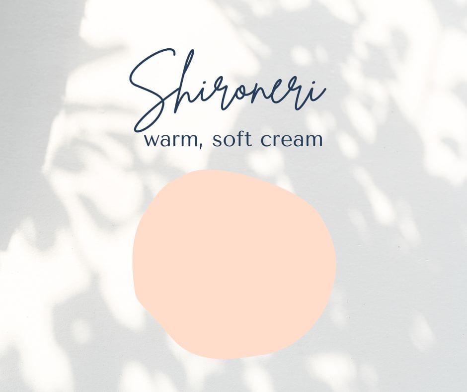
This is one of the most useful swaps in the entire palette.
Next time you’re about to buy a plain white tee, look for one in cream or ivory instead, and see how much less harsh it looks against most skin tones.
Pair shironeri with charcoal or deep indigo and one brass or wood accessory for warmth.
A linen piece in this exact tone, like these wide leg linen pants in ivory, is one of those items that quietly works with almost everything else you own.
5. Ginnezumi, the Silver Grey with Actual Depth
Ginnezumi means silver mouse, which sounds strange in English but describes a soft, warm grey with just a hint of shimmer.
It’s part of a huge historical family of Japanese greys and browns that developed during the Edo period, when color restrictions pushed dyers to get endlessly creative within a narrow range.
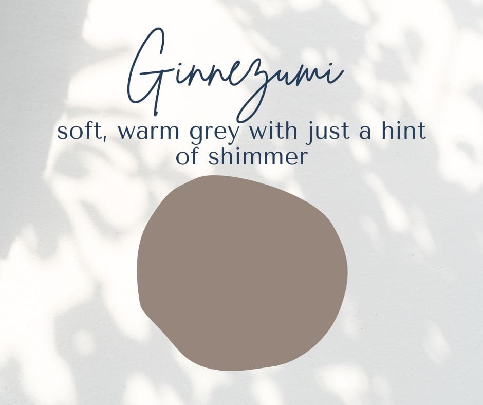
Grey often gets dismissed as flat or lifeless, but this particular shade has real warmth to it. Try it as your next coat or blazer color instead of black, and notice how it photographs softer in daylight.
Combine ginnezumi with navy and cream for an outfit that photographs beautifully without trying too hard, and pairs easily with the pieces in my post on common capsule wardrobe mistakes, also opening in a new tab.
6. Rikyucha, the Tea Brown Named After a Tea Master
This is the one I promised you earlier.
Rikyucha is named after Sen no Rikyu, the sixteenth century tea ceremony master credited with shaping the wabi-sabi aesthetic, the appreciation of simple, imperfect, natural beauty.
The shade itself is a soft, earthy tea brown.
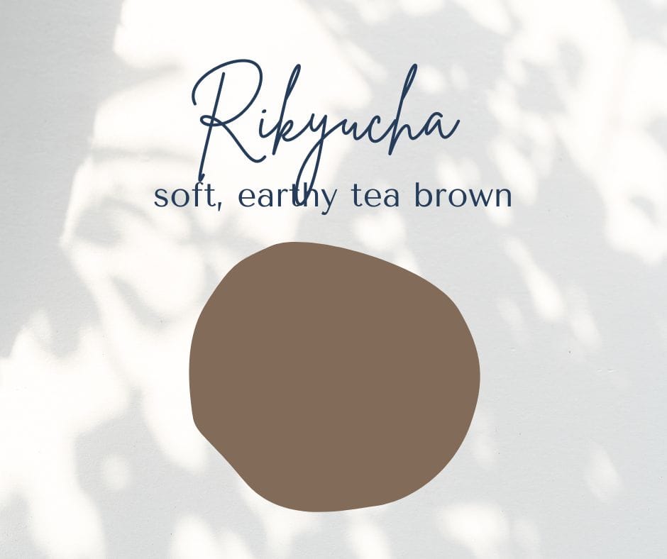
It’s the most quietly useful color in this whole list, because it bridges warm and cool tones better than almost anything else.
Layer it under kon indigo or over shironeri cream and you’ll see what I mean immediately.
Pair rikyucha with sage green and cream for an outfit that leans straight into that Japandi color palette look everyone’s saving on Pinterest right now, without ever feeling costumey.
A simple weekend outfit idea, a tea brown cardigan over a cream tee with sage green pants, photographs beautifully and takes about ninety seconds to put together on a morning when you have nothing left to give.
7. Odo-iro, the Ochre That Warms Up Any Neutral Outfit
Odo-iro is a warm, earthy ochre, closer to clay or turmeric than to yellow.
Earth pigments like this one have been used across cultures for thousands of years, and in Japan it shows up often in pottery glazes and autumn palettes.
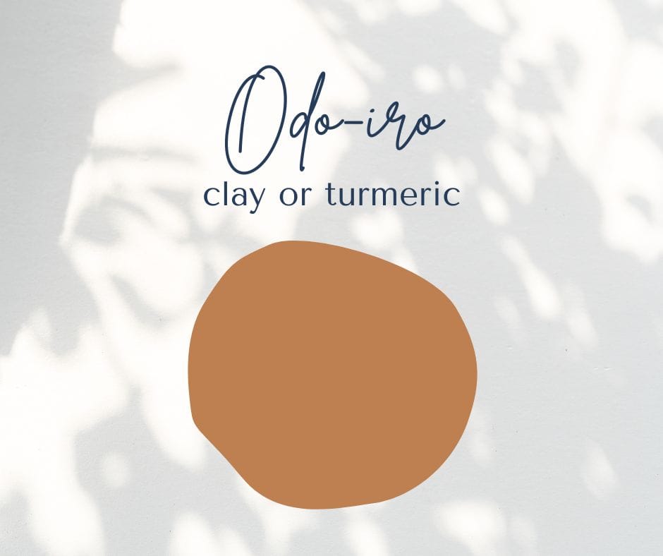
This color does a lot of heavy lifting as your one bold neutral.
Add it through a single piece, a scarf, a bag, or a pair of shoes, rather than a full outfit, so it stays an accent instead of taking over.
Ochre pairs beautifully with charcoal and cream for a fall-ready combination that still reads as calm and considered rather than loud.
8. Sakura-iro, the Cherry Blossom Pink Used Sparingly
Sakura-iro is a pale, barely there pink, named after cherry blossoms.
In Japanese culture, sakura is tied to the idea of mono no aware, a bittersweet awareness that beautiful things don’t last, which is part of why the blossoms themselves are celebrated so intensely for such a short season each year.
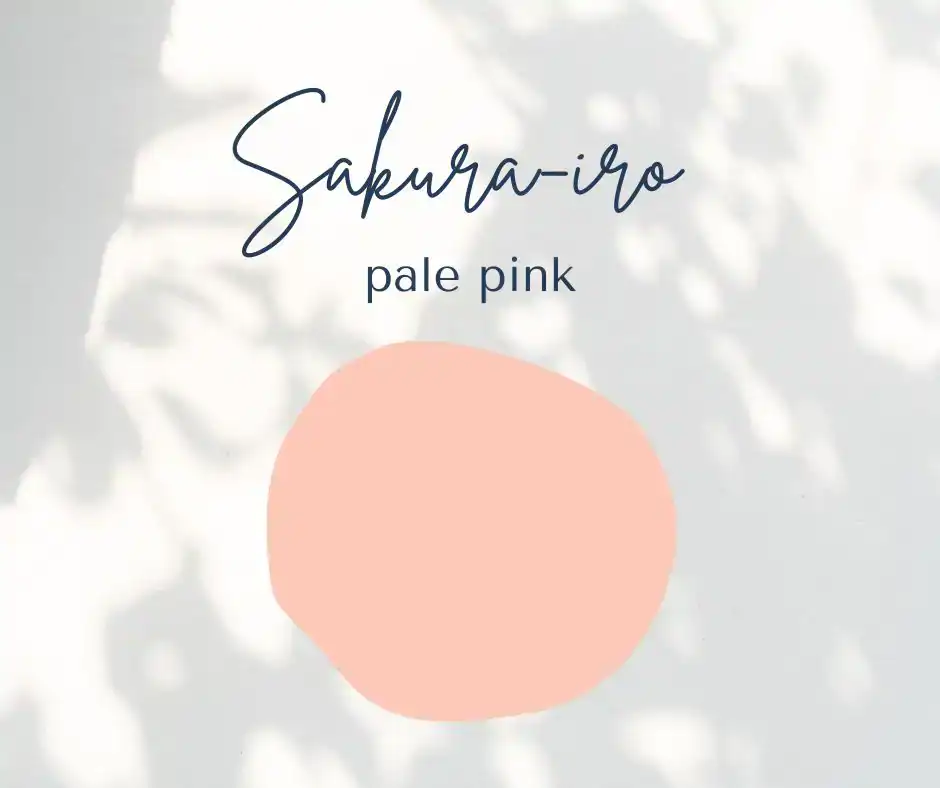
This is your soft accent, and the golden rule with it is restraint.
Use it in one piece only, a scarf, a blouse, or a small bag, never as the base of an outfit, or it stops reading as considered and starts reading as costume.
A silk scarf in this exact blush tone is an easy way to add it without overcommitting, and it pairs beautifully with sumi, kon or shironeri.
9. Wakatake-iro, the Bamboo Sage Everyone’s Pinning Right Now
Wakatake-iro is a soft sage green, named after young bamboo shoots.
Bamboo shows up constantly in Japanese architecture and gardens as a symbol of resilience and steady growth, and this shade carries that same quiet, grounded feeling.
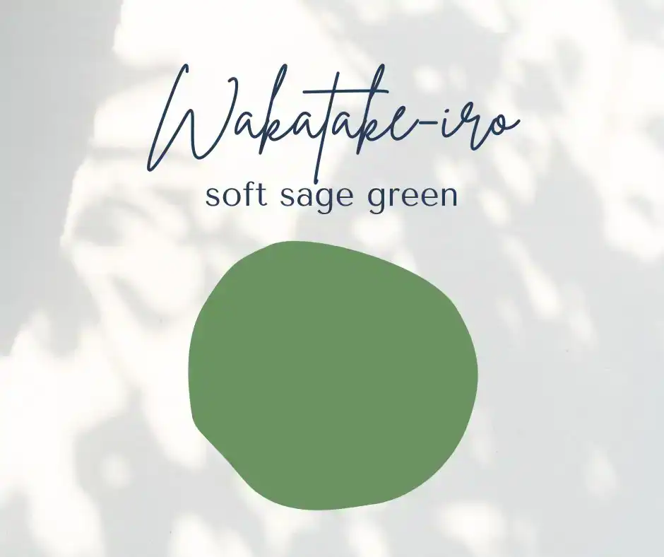
It’s probably the single most popular color in the current Japandi color combination trend, and for good reason.
Try it as a cardigan or a home textile if you’re not ready to commit to it in a full outfit yet, and let it ease you into the rest of the palette.
Combine wakatake-iro with rikyucha tea brown and shironeri cream for one of the calmest, most put-together combinations in this entire list.
It also happens to be the exact trio showing up in most Japandi outfits and Japandi color palette inspiration boards this year, so if you only try one combination from this whole post, this is a safe one to start with.
5 Japanese Color Combinations You Can Copy Tonight
If reading through nine colors feels like a lot, here’s the shortcut. These five combinations cover almost every situation, and you can screenshot this section and go straight to your closet.
| 1.) Ink black, unbleached cream, and one brass or wood accessory, for anything from work to dinner out. |
| 2.) Deep indigo, ochre, and cream, my personal favorite for fall and one of the easiest neutral color palette capsule wardrobe combinations to build around. |
| 3.) Silver grey, navy, and a single cherry blossom pink scarf, for when you want a bit of softness without going full color. |
| 4.) Tea brown, sage green, and cream, the most Japandi color palette of the bunch and a favorite for weekend outfits. |
| 5.) An all neutral base with sakura pink as the only pop of color, for the days you want to feel a little more done up without much effort. |
What to Avoid When You’re Just Starting Out
A few honest mistakes I made early on, so you can skip them.
Buying every color on this list at once.
That’s not restraint, that’s just a different kind of overbuying, and you’ll end up right back where you started with a closet full of things that don’t quite work together.
Choosing the trendiest shade of the moment instead of the one that actually suits your skin tone.
Wakatake-iro sage looks incredible on some people and washes others out completely, and no amount of Pinterest popularity changes that.
Forgetting texture entirely.
Two pieces in the exact same shade of cream can look completely different depending on whether one is linen and the other is a shiny polyester blend.
Texture is doing at least half the work in every outfit that looks effortlessly put together.
Save This – Japanese Color Palette Checklist
Pin this so you can come back to it next time you’re standing in front of your closet feeling stuck.
- One deep neutral as your base color
- One warm neutral to soften and bridge it
- No more than one accent color per outfit
- Texture doing more of the work than pattern
- Natural fabrics like linen, cotton and wool whenever your budget allows
- Cream instead of stark white
- Charcoal instead of pure black
- One quality piece over three cheap ones in the same category
- A new color only bought if it works with at least three things you already own
Little Steps – Do This
1.) Sort your closet by color family for ten minutes today, nothing fancy, just piles.
2.) Remove one item that genuinely doesn’t match anything else you own.
3.) Add a single sage green or tea brown piece the next time you shop instead of reaching for black again.
4.) Take a photo of your favorite recent outfit and notice which two colors you actually wore the most.
Save this pin for later!
Quick Shopping Checklist
- Check the fabric tag before you check the color.
- Hold the item near your face in daylight, not under store lighting.
- Ask yourself if it pairs with at least three things you already own.
- Skip anything that only works with one very specific outfit.
If you’re building out a few new pieces around this palette, an indigo dyed cotton top is an easy, versatile place to start, and it holds its color far better over time than most fast fashion indigo prints.
FAQ – Honest Answers to the Questions You’re Probably Asking
There isn’t one single official name for it. It’s usually referred to as traditional Japanese colors, or nihon no dentou shikisai in Japanese, and it covers hundreds of individual shades built up over centuries of dyeing and painting traditions.
Not quite. Japandi is a newer, blended aesthetic that combines Japanese minimalism with Scandinavian design, mostly used in interiors and increasingly in fashion. The color logic overlaps a lot, but Japandi tends to lean slightly lighter and cooler overall.
Nothing is technically banned, but neon brights, stark pure white, and more than two accent colors in one outfit will pull you away from this palette fast. It’s about restraint more than any specific forbidden shade.
Yes, absolutely, just as the one accent rather than the whole outfit. A bright color on its own against a neutral base actually stands out more than it would surrounded by other bright pieces.
Shironeri cream. It’s the single easiest swap, since most of us already own something white that we can simply replace with a warmer cream version.
No, and honestly you shouldn’t. Start by sorting what you already own into these color families, then fill actual gaps slowly with one or two new pieces at a time.
Very much so. It’s essentially the same logic behind the Japandi color palette trend in interiors, so pieces you already love in your closet often work as inspiration for a room too.
Shironeri has warmth built into it, closer to raw silk than to bleached cotton. Plain white can look harsh under artificial light, while shironeri tends to photograph and wear more gently.
Not at all. Ai-iro and shironeri were both traditionally used in lighter summer garments, so the palette adjusts easily for warm weather, you’re just leaning on the lighter shades more.
Hold a few options near your face in natural daylight. If your skin looks brighter and more awake, that’s your base neutral. If it looks a little tired or flat, keep looking.
It shouldn’t, since texture, layering and the one accent color you choose each day do most of the visual work. A wardrobe with fewer colors actually tends to feel less repetitive over time, not more, because everything mixes with everything else instead of sitting in its own separate outfit.
Not at all, and please don’t donate a full closet in one weekend out of guilt. Just notice which bright pieces you actually reach for, keep those as your accent colors, and let the rest quietly rotate out as they wear out naturally.
What You Actually Need to Get Started
You don’t need a shopping list to start this, you need about twenty minutes and a willingness to look at what’s already hanging in your closet. That’s genuinely how it works.
Start by sorting everything into three loose piles:
- deep neutrals,
- warm neutrals, and
- everything else.
The everything else pile is usually the biggest one, and that’s normal, most of us collect colors gradually without ever choosing them on purpose.
From there, the only real tool you need is patience with yourself.
This isn’t about a weekend overhaul. It’s about noticing, the next time you reach for something new, whether it actually belongs with what you already have, or whether it’s just another color competing for space.
The Surprising Truth About “Neutral” Colors
Here’s the pattern interrupter. We tend to think of neutral as boring, the color equivalent of staying quiet in a meeting so nobody notices you.
But in Hungary, where I grew up, my grandmother’s whole generation dressed almost entirely in a handful of muted colors.
Options had little to do with it. Fabric was expensive and hard to come by, so a wardrobe built around three or four colors meant everything matched everything else, every single time.
Color historians often point to a similar pattern in Japan’s Edo period, when strict laws limited how much bright or luxurious color ordinary townspeople were allowed to wear. Dyers responded by developing dozens of subtle variations of brown and grey instead, refining restraint into an art form rather than treating it as a punishment.
Eastern Europe and Japan landed on the same solution from opposite sides of the world.
Color restraint isn’t a limitation. It’s a system, and it’s one you can borrow for your own closet.
I think about this every time someone tells me a neutral wardrobe sounds boring. My grandmother never once complained that her clothes lacked color. She complained when a button fell off, or when a hem needed mending, because those clothes had to last.
There’s something worth borrowing in that mindset too, buying fewer colors, but choosing pieces built to actually last long enough to matter.
Recommended Reading
If this post was useful, you’ll probably enjoy my 11 essential secrets to master Japanese minimalist fashion, my simple capsule wardrobe guide for every season, and my tips on packing light without overpacking your suitcase, all of which open in a new tab so you can save them for later.
Color is such a small thing to change and such a big thing to feel.
I didn’t expect a handful of muted shades to make getting dressed feel calmer, but here we are, and my closet has never made more sense.
What’s the first color from this list you’re going to bring into your closet?
You Might Also Like
- Sweater Outfits: 11 Fresh Ways to Wear One Burgundy Sweater All WinterIn this post I’ll show you how to wear one burgundy sweater 11 different ways, from a Monday at the office to Christmas Eve dinner. You’ll also find color pairs, the mistakes that make a knit look tired, and simple care tips that keep it soft for years.
- Christmas Savings Challenge: A Printable Tracker for Weekly and Biweekly PaydaysThis christmas savings challenge turns the cost of December into small, planned amounts you set aside from now until the holidays. You’ll find 8 simple challenges with the real math for weekly and biweekly paydays, plus a free printable tracker to color in.
- 9 Black Friday Shopping Tips That Keep Your Closet SmallThese 9 Black Friday shopping tips help you buy the few things you need and skip the rest, without missing a real deal. You’ll find a simple wish list method, an easy way to spot fake discounts, and a plan for the week that keeps your closet small.